Posts

Project 3 Plans + How it Relates to My Infographic
Image
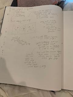
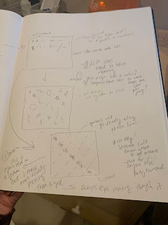
   So I’m steadily continuing work on the joy booklet. I LOVE this project and not only do I enjoy designing this but it has allowed for a great reflection. I love looking back at what I’ve written so far and this is a great excuse to do so. I haven’t done a ton more work since last week as I have been trying to finish all the finals stuff that’s going on right now. BUT the sketch below shows what I’ve been thinking about so far. I have a solid plan, I was just trying to visualize it. I wanted to come up with some sort of axis or path for my icons to follow as it will sort of be a “visual gratitude journal” as Hannah put it which I think is a great way to describe it.  I came up with this sort of diagonal axis by day to place my icons along and I still like this idea but I think it needs to happen more organically on the page. Once I come up with my icons I’m going to start sketching them and see what works best from there. This goes back to how I need to just let the data guide ME ins

Project 3!!! (and don't forget the Infographic)

Image
I am really looking forward to working on this project even though there is a short timeline! When I first started collecting data this past week, the first thing I thought of was the Giorgia Lupi lecture we watched at the beginning of the semester and the postcard project she did with her friend for a year. I have been using my gratitude journal since around the halfway point of this semester and decided to use everything I have recorded in it thus far leaving me with a lot of data to go through. Though it is exciting to look back and see what I have written about because, like the goal of this project, it brings me joy and also reminds me of what happened on each day. During Monday’s class I began tagging each “piece of joy” with the values that Hannah shared with us. Some had around three to five tags while some had only one so it depends. The images below show me working through all of this data as I outlined each tag in sections. I then tallied them all up and my top four values w

Moving Forward Plans

Image
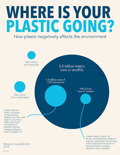
I am making progress with my infographic and am really liking the direction. I think I started off really slow in how I wanted to present implication and how I wanted to show that plastic is bad, but I am on the right track now. I’m really happy with the new deadlines that Hannah announced because it gives me more time to fully flesh out the infographic as well as starting a new and exciting fun mini project. Below is my most recent progress on my infographic. I have taken away the full circle of plastic generated and am now just focusing on the scale between the different places plastic is going. My main focus is to show the striking difference between how much plastic is recycled vs. how much ends up in landfills and therefore negatively affects the environment. I am also trying to use text to further explain why the plastic in the oceans and the CO2 emissions is bad, but need to find a better way to do this at first. My most recent meeting with Hannah was extremely helpful. I realiz

Formatting & Experimenting

Image
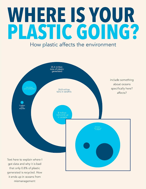
I am really excited for the remainder of this project! Monday and today (Wednesday) have been extremely helpful with guiding me in the right direction. I also think between last week and this Monday I have made a lot of progress in how I want to display my information. I still think it is not fully fleshed out and I want to rethink a bunch of aspects. The screenshot from below shows my current progress. I am choosing to focus on using the circle graph to display information because a lot of the data fits within itself and is very causational (haha is this a word?). For example, out of all the plastic generated I want to show where it all goes within itself- the amount of plastic that exists on the earth will always stay the same because it doesn’t go anywhere (such a small amount is recycled/combusted compared to how much exists in landfills/oceans). Plastic also takes a gazillion years to decompose so I wanted to emphasize how the overall amount doesn’t change- it’s how it's distr

Struggling w Data

Image
Blog Post 11/6/20 So this week has been a lot and I honestly haven’t made that much progress from my last post. Though I have solidified a topic so that’s good! I have been jumping around with different topics since this project started trying to find one that I was interested in research and had a good amount of data to work with. I have moved away from specifically focusing on the beauty industry and am now looking at plastic in general. This is a topic that I am interested in through my daily life as I am trying to eliminate single-use plastic as much as possible for about a year now! I wanted to focus within the beauty industry first as I thought it would be a good way to narrow this down and I was interested in the topic because I am an avid consumer of products BUT found out after trying to do a deep dive, that a lot of information around this industry is not public knowledge. Companies don’t release their data and not a lot of research exists around it already- so I became broad

Project 2 Data: Implication!!!!!!

Image
This week my new focus is on implication. I had a great meeting with Hannah that showed me I need to dig deeper in my research to show how my topic is important. I am still at the sketching stage (see below) and I think I kinda jumped the gun (as usual ugh) with data visualization. I really liked the website with the different kinds of data visualizations (the one with the blue circles) and I spent a lot of time exploring different methods to portray my data. However, I started doing this before I had my concrete data set up. I still need to do some research about how waste in the beauty industry negatively affects the environment and what that means for people looking at my infographic. Hannah’s main question was just “why?” Moving forward, I need to focus on finding hard/concrete data before I continue sketching how to represent that data. I think my main trouble with this is that a lot of the data I have been finding are individual statistics. For example, waste from the beauty indu

The Start of Project 2

 I am really excited for this project! It will be a data visualization of sorts, kinda similar to an infographic but I think more refined. I don't have anything yet to show for this project except research, which can be found here: https://docs.google.com/document/d/1VB-FmgRJcn7wMTWysu6jnd-Jat0-0f20ZXpLRYEG6-0/edit?usp=sharing I would say im in between topics right now with some minimal research in each to see which interests me more. For Monday's class (10/19) I came with research on the defunding of arts programs in early education. I am still interested in this but I am exploring other options just so I don't feel stuck too early on like I did with the last project. I think I need to pick a really exciting topic that I will look forward to designing for throughout the entirety of the project.  My other options are food insecurity (I took an Environmental Justice class last semester and it was my favorite LSA class I have ever taken and I learned a lot about this- though