Formatting & Experimenting
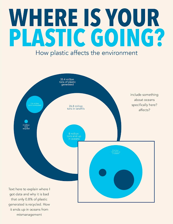
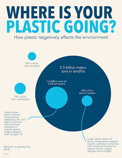
I am really excited for the remainder of this project! Monday and today (Wednesday) have been extremely helpful with guiding me in the right direction. I also think between last week and this Monday I have made a lot of progress in how I want to display my information. I still think it is not fully fleshed out and I want to rethink a bunch of aspects. The screenshot from below shows my current progress. I am choosing to focus on using the circle graph to display information because a lot of the data fits within itself and is very causational (haha is this a word?). For example, out of all the plastic generated I want to show where it all goes within itself- the amount of plastic that exists on the earth will always stay the same because it doesn’t go anywhere (such a small amount is recycled/combusted compared to how much exists in landfills/oceans). Plastic also takes a gazillion years to decompose so I wanted to emphasize how the overall amount doesn’t change- it’s how it's distributed that does. The screenshot below shows the main circle graph as well as a call out box where I intend to put more information specifically about plastic in the oceans.
What I gained from today has helped me in terms of visual aspects to fix as well as some small informational tweaks. I need to fix some color aspects. For example, right now the landfill circle is the same as the background so it reads as negative space, so I need to play around with color more there. Also another piece of critique I got was that my text sizes are too small. Which I knew but was kinda just placing things, but now I need to go back and strategically place the percentages. For example, the striking difference between the landfill circle and recycling circle is not emphasized enough and it needs to be as that is the main piece of information I want someone to take away from the poster. Another point that Rachel brought up that I found very useful was how I can rework the call out box. I definitely want to use that piece of information to show more implication of the plastic and how it affects the oceans. 1. Here is where the plastic is going, 2. Here is how it affects the environment. Right now though I just placed the call out box and didn’t use it effectively. She brought up a cool idea of maybe having the 8 million circle flow/segway into another piece of information where I could share this other data. I think that’s a really cool idea and something that I kinda saw Michelle do something similar in her rough drafts on Box.
Moving forward, I think I just need to fully flesh out all my ideas. Everything I mentioned above is what I plan to work on. I also think compositionally I want to rethink the poster. I kinda just stuck to a standard size but haven’t thought yet about what format will best suit the data. I will keep playing and working with it to see but I think horizontal could also work, especially if I choose to make the circles bigger and have the 8 million ocean circle expand. Really excited to keep working on this project and super thankful to Hannah for extending it!


Comments
Post a Comment