Struggling w Data
So this week has been a lot and I honestly haven’t made that much progress from my last post. Though I have solidified a topic so that’s good! I have been jumping around with different topics since this project started trying to find one that I was interested in research and had a good amount of data to work with. I have moved away from specifically focusing on the beauty industry and am now looking at plastic in general. This is a topic that I am interested in through my daily life as I am trying to eliminate single-use plastic as much as possible for about a year now! I wanted to focus within the beauty industry first as I thought it would be a good way to narrow this down and I was interested in the topic because I am an avid consumer of products BUT found out after trying to do a deep dive, that a lot of information around this industry is not public knowledge. Companies don’t release their data and not a lot of research exists around it already- so I became broader and have now landed on plastic in general.
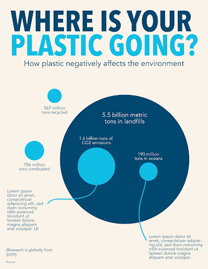
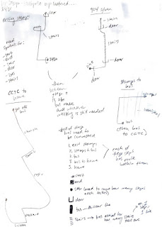
The screenshots below show the way I am currently thinking about data visualization. I am interested in representing where the plastic is going after it is made to show the many different ways it affects the environment. But after my talk with Hannah today, I am still struggling with the WHY. Hannah brought up a good point that a lot of what I’m thinking currently exists in my head but I’m still not visualizing it yet. I think not only do I need to find a good way to represent the data (which is what I was focusing on) BUT I also need to include in the actual poster the why- why is plastic bad for the environment and maybe not just WHERE it's going but the negative effects it has. I also do need to find more data. I found a good 2-3 percentages to use but when looking at it as a whole, the full picture is still missing. I do like the circle graphs for showing pieces of a whole and I’m thinking I can continue this idea and flesh it out more.
Monday goals:
finally finish collecting all my data- I need to account for where the other 326 million tons of plastic go
incorporate dramatic effects of plastic on the environment. I can’t just show the figures but I need to show the why that exists in my head at the moment.
I think part of this can be done through depicting what it actually looks like within the environment. Right now it is represented very abstractly
THOUGH, Hannah did advise another peer to stray away from icons/illustrations so not sure if I should also go in that direction but we will see- maybe they don’t need to be necessary for displaying information but can be supplementary elements

Comments
Post a Comment