Moving Forward Plans
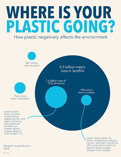
I am making progress with my infographic and am really liking the direction. I think I started off really slow in how I wanted to present implication and how I wanted to show that plastic is bad, but I am on the right track now. I’m really happy with the new deadlines that Hannah announced because it gives me more time to fully flesh out the infographic as well as starting a new and exciting fun mini project. Below is my most recent progress on my infographic. I have taken away the full circle of plastic generated and am now just focusing on the scale between the different places plastic is going. My main focus is to show the striking difference between how much plastic is recycled vs. how much ends up in landfills and therefore negatively affects the environment. I am also trying to use text to further explain why the plastic in the oceans and the CO2 emissions is bad, but need to find a better way to do this at first.
My most recent meeting with Hannah was extremely helpful. I realize I am not utilizing color enough to show how I want my information to be read. There is a hierarchy of information that is not flowing well at the moment. Moving forward my plans are to change the colors of the recycled and combusted circles to the same navy as the landfill circle to show that they should be read at the same level. Then I also want to change the colors of the ocean and CO2 circles to be darker to show how they belong within the landfill circle and come from that amount. I have stuck with this blue theme since the beginnging but I think it might also be beneficial to play around with other colors (some suggestions are orange and green) because I'm not ONLY talking about the ocean but the blue theme kind of communicates this. I also like Hannah’s idea of placing the darker circles all on one level so they are all read first and together as the main focus of the information. Format is also an issue for me. I chose this vertical poster size format and have stuck with it throughout for no reason. Hannah brought up a good point that I should just rework the format and start over with a giant artboard and no boundaries. That way the data can be placed wherever it needs to be and not be restricted by formatting. I think this is also an issue I have seen with my peers. Another point brought up by peers regarding the call out text connected with string is that this format definitely needs to be reworked. It is unclear what the strings are- balloons, jellyfish, etc. so I want to come up with a better way to present this information yet still show how it connects to the corresponding bubbles.
Moving forward I am excited to continue working on my infographic and I’m not tired of it yet! In terms of deadlines with the new flexibility, my plan is to aim for this to be done on Monday and start the new project. However, I will not be too strict and if this doesn’t happen then I will overlap the two projects and turn them both in by the end of the semester. I am also looking forward to the second project. I have recently started keeping a gratitude journal which I am really enjoying so I also think this will be a great place for me to collect my own data from. I will work on making these changes to my infographic so my information can be read how I intend and also start collecting data for project 3!


Comments
Post a Comment