Project 2 Data: Implication!!!!!!
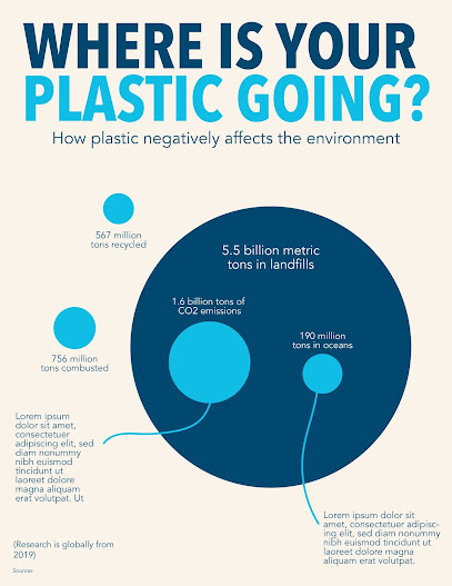
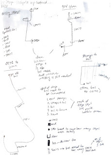
This week my new focus is on implication. I had a great meeting with Hannah that showed me I need to dig deeper in my research to show how my topic is important. I am still at the sketching stage (see below) and I think I kinda jumped the gun (as usual ugh) with data visualization. I really liked the website with the different kinds of data visualizations (the one with the blue circles) and I spent a lot of time exploring different methods to portray my data. However, I started doing this before I had my concrete data set up. I still need to do some research about how waste in the beauty industry negatively affects the environment and what that means for people looking at my infographic. Hannah’s main question was just “why?”
Moving forward, I need to focus on finding hard/concrete data before I continue sketching how to represent that data. I think my main trouble with this is that a lot of the data I have been finding are individual statistics. For example, waste from the beauty industry contributes to ___% of landfill. But this doesn’t give me other statistics to compare it to. I think what I want to focus on is how waste in the beauty industry compares to that of other sectors- food, etc. This is what Hannah brought up to me that I didn’t begin to understand yet. I got excited about how to represent the data that I already had without collecting enough to see a full picture. I am glad that I didn’t start layout on Illustrator yet though because I still feel like I have the flexibility to do some more in depth research.
My plan for next class and onward is to find solid data to use before I even begin to start laying it out again. Without solid data/sources my infographic means nothing so that is what I plan to focus on moving forward. I really need to hunker down and do some in depth searches. I have been navigating the Umich library resources and am finding a lot of articles (that is where the independent stats come from) but I think finding some academic studies might be helpful in seeing how data is comparable. Also looking at what graphs already exist from this could be beneficial to how I choose to represent my data. I am excited to see where the data takes me and explore the best ways to present it. At the moment I am inclined to use bar graphs and pie charts because of the nature of the packaging but am wondering if there’s a more sophisticated way to do it.

Comments
Post a Comment