2nd Design Iteration- Waaaay Too Color Crazy
Blog Post 10.2.20
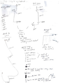
At this point in the project I will honestly say I am stuck, or somewhat in a funk. These are my iterations that I presented in class on Wednesday, 9/30/20 and I am not happy with them at all. These are 4 different banner designs to be used in each dorm. The order from left to right is the order in which I designed them. They are a bit all over the place and messy and not indicative at all of the work I’d like to be creating for this project.
So looking back at them and after critique, I do realize there are redeeming qualities to these banners. A lot of the feedback I got during critique was that the information is legible in terms of layout and composition however it’s the color choice and layering that doesn’t work, and I completely agree. These designs were made over time and I think more so out of my wanting to produce SOMETHING even if I wasn’t necessarily happy with the outcome. I am also a little unsure where these designs came from. I think it was mostly just a result of me playing around with different shapes and colors without thinking about the big picture. I know this is still an important part of the process however I am leaning towards rethinking the design direction. Also thinking more about the meaning of the design and where to include a map, and how to think about it in terms of a system, etc. I also think what has been difficult for me is designing on the banner layout- it is a very awkward shape as it’s very long and vertical, as opposed to a poster design which allows for a more equal distribution of space. I still want to continue with this banner shape however as I think having such a large, central, informational design like this in the dorms is beneficial to the system.
Moving forward my main concerns are fixing the color palette to be way less crazy and loud- as it is hard to read at the moment and kind of creates a “vibration” effect (this was said in critique) which I 100% understand and creating a READABLE banner design that is more informational and educational. My playing around without thinking about the implications of the design has given me useful information to use moving forward though I want to go in a different direction. I am trying to move forward with the design and not let this hold me back (I find that when I am stuck in a project it makes it harder for me to move on into a new idea- but this is something I want to work on as a designer). However, I do appreciate the primary color palette I was leaning towards and want to figure out if there’s a way to streamline this into something more readable and appealing. I think the primary color palette does lend itself toward a system that would be less intimidating for students to approach as it resembles an almost elementary feel.
**One thing I will add in terms of feedback: I did present these to a couple freshmen living in the dorms and both said they would stop and read the first 2.

Comments
Post a Comment