Toothpaste Map 9/10/20
Blog Post 9.11- Toothpaste Map Project
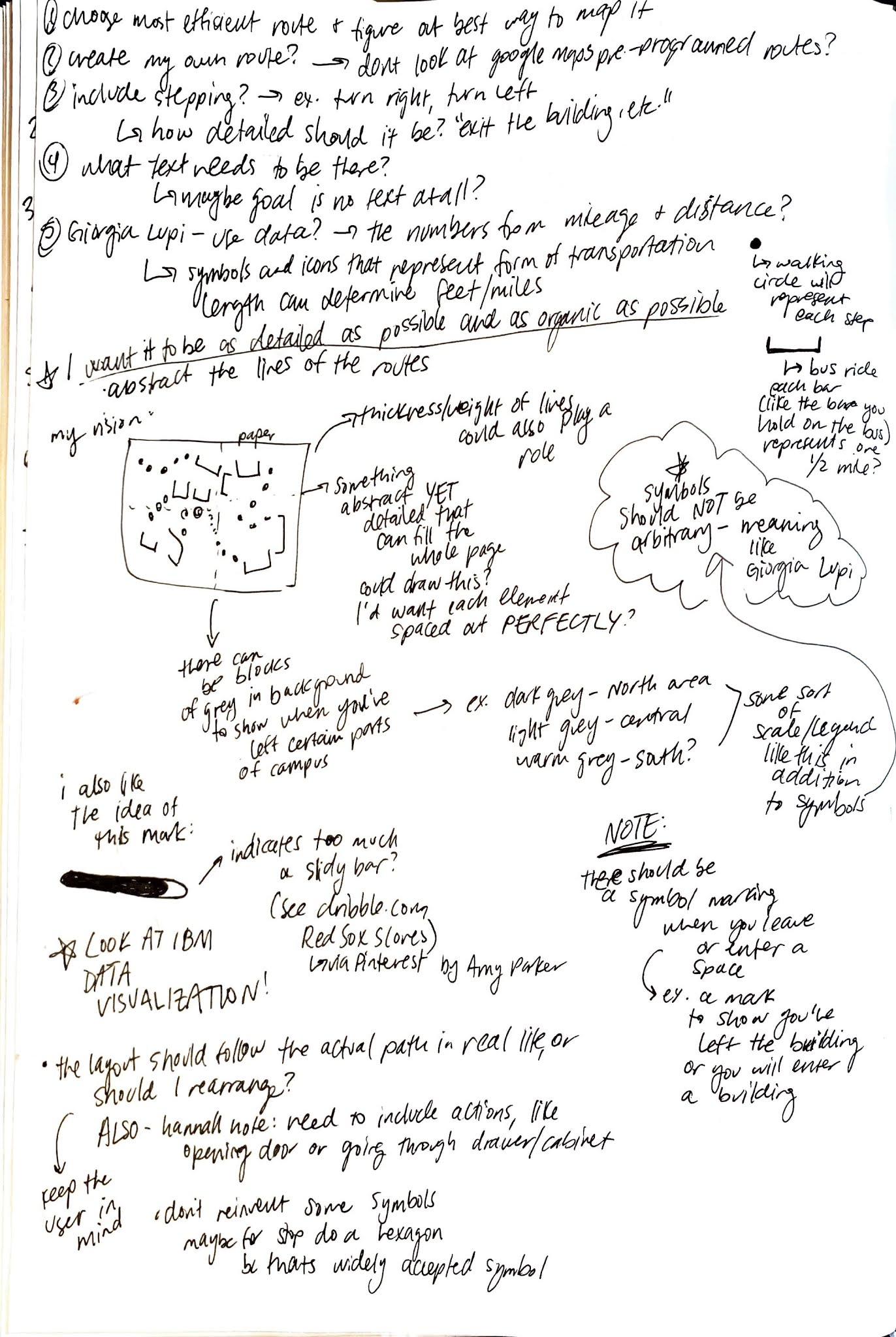
These pages show my sketches and brainstorming for my Toothpaste map (showing how to get from Stamps, Room 2420 to my house/bathroom at 924 Sylvan Ave). The first few pages are my ideas and sketches, working through the route I wanted to go for this map and the different symbols I was planning to use. I also include references in these notes, specifically about Giorgia Lupi’s talk. The last image is the final map I turned in for the assignment.
Looking back at my brainstorm sketches, I find that I didn’t seem to work through many drastically different ideas. I took a pretty logical approach to this map assignment and really chose to focus on just using the necessary information. I started with a quick look on Google Maps to see what the route looks like visually and started to design my map from there. I think I was very focused on how to best display ONLY the necessary information that I didn’t venture into adding additional design elements- I think this also comes from the reading I did in the textbook that outlined the different types of information and which categories were absolutely necessary. My map is a very simple application.
If I were to do this project again one thing I would focus more on is scale. This also came up during our small group critiques. I was having a lot of difficulty with the sizing of my map because I wanted the information to be as accurate as possible. This would mean not resizing elements so that they wouldn’t match the actual information. I was on North Campus after this project was assigned and decided to loosely take notes of how many steps I actually took so I could apply this information to my map. The circles representing each step should be relatively accurate to how many steps I actually took. I felt that I didn’t want to sacrifice this accuracy for the sake of the scale of the map, however I think visually that would’ve made more sense. Looking at my map, the legend is much larger in scale compared to the actual map itself so this would be something I’d want to fix as well.
I also would want to create this map again somehow without even using a legend. I feel that yes someone would be able to follow my map, however it’s design is not intuitive in that they would be able to read it without the legend. This goes back to the idea of pragmatic design that we talked about in our last class discussion, and it is something I definitely want to work on and explore more throughout this class.


not sure why the text looks like this but I will figure it out!
ReplyDelete